Why this question matters
There is a whole category of products being sold right now on the promise that AI can produce client-ready visuals for local businesses. Menus, price lists, flyers, promo posts. The pitch is that a freelancer with no design skills can charge local businesses for work that takes seconds.
That pitch rests on one assumption: that AI image models can render text and numbers accurately. If a menu comes out with the wrong price on it, nothing else about the product matters. So before buying anything in this category, I tested the assumption directly.
I was expecting the text to fall apart. That is the well known weakness of image models, and it is the failure I went looking for. I did not find it.
What I tested and how
I invented a cafe rather than use a real client, and I am publishing the full source data so the test is repeatable. The business does not exist.
- Marrow & Pine, a neighbourhood brunch cafe
- 142 Wilcox Street, Ashgrove
- Phone (07) 3812 4460
- Hours: Tue to Sun, 7am to 2pm. Closed Monday.
The menu data was designed to be difficult on purpose:
| Item | Price |
|---|---|
| Sourdough with cultured butter | 8.50 |
| Three-egg omelette, chives | 16.00 |
| Smashed peas on rye, poached egg | 18.50 |
| Buttermilk pancakes, maple | 19.00 |
| Slow-roast mushrooms, labneh | 21.50 |
| Bacon and egg roll, tomato relish | 14.00 |
| Filter coffee | 4.50 |
| Batch brew, 500ml | 7.00 |
Each element is there to catch a specific known weakness:
- Prices with decimals that are not round, because models like to round or invent
- Words that are easy to misspell: labneh, buttermilk, relish
- A unit of measure, 500ml
- A phone number in a fixed format, where a single wrong digit makes the menu useless
- A negative statement, Closed Monday, which models often drop
I ran the same prompt four times for the single-page menu, without editing a single word between attempts. Changing the prompt between attempts would have measured my prompt writing rather than the model.
What worked, and it worked better than I expected
Every item name was spelled correctly. Every price matched, including 8.50, 18.50 and 21.50. The phone number was correct digit for digit. Closed Monday survived. So did 500ml.
Four attempts, four correct results. Then on the two-page test I added drinks priced at 5.20 and 6.80 specifically because they are not round numbers and not the .50 pattern the model had already proven it could handle. Those were correct too.
If your mental model is still that AI cannot write accurate text inside an image, that mental model is out of date. Mine was.
What broke
1. It invents a new logo on every single run
The model invented a mark for the cafe without being asked: a bone crossed with a pine sprig, which is a genuinely clever reading of the name. Then it invented a different one on the next run. And a different one again after that.
Same prompt, not one word changed between attempts. Here are three runs side by side, with the mark circled.
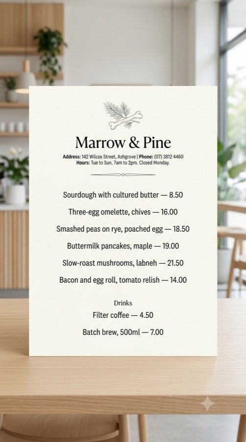
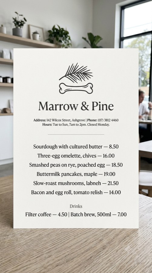
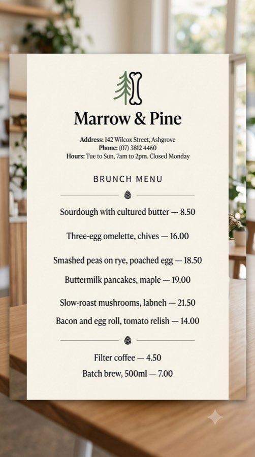
Every price on all three is correct. Every logo on all three is different. Run 3 introduced colour on its own while the other two stayed monochrome.
I also ran the two-page test, asking for page two in the same conversation with an explicit instruction to match the style, typeface, colours, layout, borders and logo. The typeface matched. The paper tone matched. The logo did not.
This is worse than a spelling error, and it is worse than it looks at first. For a local business the logo is the brand. And because the font and the paper stay consistent, the whole thing reads as coherent at a glance, so it is easy to miss and easy to send to a client by mistake.
2. The layout is not stable either, only the data is
Look past the logo and the three runs are three different documents. One gives drinks a section heading. One squeezes both drinks onto a single line. One adds a Brunch Menu title and decorative pinecones that appear nowhere in my prompt.
The practical consequence is the one that actually costs money: you cannot produce a matching set. Not a two-page menu, and not a menu this month with a flyer next month that looks like it came from the same business. Local businesses need materials continuously, and continuity is exactly what this cannot give you.
3. You get a photo of a menu, not a menu
I asked for print-ready, portrait orientation. What came back was a photograph of a printed menu card standing on a table, with perspective, a background, and a shadow.
It looks good. It is also not a file you can send to a printer or hand to a client. To use it for real you would rebuild it flat in something else, which means the AI did the easy part and left the part that takes skill.
This is the finding I did not see coming, and the one nobody selling this category mentions. The gap is not accuracy any more. The gap is that the output is an image of a deliverable rather than the deliverable.
4. Small text on secondary objects is nonsense
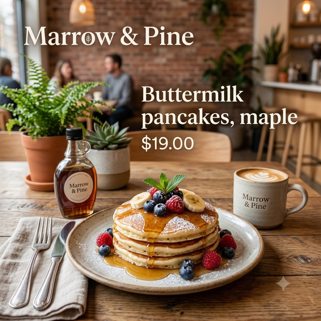
In the promo post, the syrup bottle carries the business name correctly and then a second line of characters that only resembles writing. Nobody reads it in a mockup, but it marks the boundary clearly: large text is accurate, incidental small text is invented.
5. It does not do exactly what you tell it
Three small deviations, none fatal, all worth knowing:
- I gave the price as 19.00 and said not to change any wording or numbers. It added a dollar sign.
- I listed the items and said do not add items. It added a Drinks subheading that was not in my list.
- I asked it to mark the pages as page 1 of 2 and page 2 of 2. It ignored that completely, on both pages.
Two of those changes are arguably improvements. That is not the point. If a model quietly edits your input on a menu, you have to check every field every time, and checking every field every time is the cost this category never puts in the sales copy.
6. There is a visible AI mark on the output
Both images came out with Gemini's sparkle glyph in the bottom right corner. If you hand this to a client you hand over Google's marker with it. Cropping it out shifts your framing, and on a portrait menu there is not much room to lose.
What this means if you sell visuals to local clients
The workflow that follows from this test is narrower than the pitch, and still useful:
- Use it for concepts and pitching. Generating three menu directions to show a cafe owner before any real design work happens is a genuine time saver, and mockups are exactly what mockups are for.
- Use it for one-off social posts where a lifestyle photo with text on it is the actual deliverable. That is the one case where the output format is not a problem.
- Do not use it for the final file on anything printed, anything multi-page, or anything carrying a fixed logo. Set the text and place the real logo in a tool that can hold both exactly.
- Check every number every time, even though it was right four times out of four for me. Four is not a guarantee, and a wrong price on a printed menu is your problem, not the model's.
Who should skip this approach
If you deliver print files, this does not replace your process. If your client has an existing logo and brand rules, this will not hold them. If you are selling menu design as a service where consistency across a set of documents is the whole value, the logo problem alone rules it out today.
If you are making single social graphics for small local businesses that currently have nothing, this is a real upgrade over what they have.
Limits of this test
One model, one day, one business type, one prompt written by one person. Four attempts is enough to say the text accuracy was not a fluke, and not enough to call it reliable. I did not test other image models, and I did not test whether a different prompt would hold the logo steady.
If you run this and get a different result, tell me and I will publish the correction.
Why there are no affiliate links here
There are products in this category I could have linked. I tested the assumption underneath them instead, and this page sells nothing. Reviews on this site do carry affiliate links and say so. This one does not, because there was nothing to buy in order to find any of it out.